Friday, February 11, 2011

I have the BEST mother-in-law!


A few months ago my mother-in-law came to me to help her make over her master bathroom. I was so excited to be able to help and so thankful to her. She put everything in my hands and with a budget of about $400 we were able to change window treatments, paint and accessories.

These are the before pictures:

This green can make a person look washed out-not the best color for a bathroom with an
oversized mirror! The accessories also needed a little updating!


These are the after pictures: I chose a shade of blue that would complement the ice blue tiles in the tum and shower. The window treatments warmed up the space and gave it a rich feel. The also have a thick fabric backing to keep out the heat and cold as well as providing privacy. I bought all of the accessories at West Elm.

Afterwards, My mother and law told me that everyone she showed the room too loved it, even the men in the family! It was a great experience that taught me about staying within a budget, color schemes and accessory placement.

Friday, November 12, 2010

Chapter 7- Principles


Transformation

Transformation refers to a growing change among an object.

The image above shows how Frank Gehry's architecture represents a single form that undergoes a transformation. The transformed shapes are repeater throughout the structure.

Image From:
http://billbarr.wordpress.com/category/get-2-know/

Chapter 7- Principles


Rhythm and Repetition

Rhythm and Repetition are principles of design that give a space a cohesiveness.

The image above shows how lighting and wall patterns can give an interior rhythm and repetition.

Image From:
http://www.archidose.org/Nov99/112999.html

Chapter 7- Principles


Datum

Datum referes to a line, plane or volume in which other elements relate.

The image above shows how the white city was planed so that the cornice of all of the buildings was at the same height.

Image From:
http://www.lasplash.com/publish/Entertainment/cat_index_chicago_events/The_Devil_in_the_White_City_Review-Chicago-Architechural.php

Chapter 7- Principles


Hierarchy

Hierarchy is shown by giving something a visual clue that it is more important than something else.

The images above show how the dome in the center is more important because it is larger and has more ornamentation.

Image From:
http://www.skyscrapercity.com/showthread.php?p=37318974

Chapter 7- Principles


Symmetry

Symmetry means that something is the same on both sides.

The image above shows how a framed mirror can be symmetrical.

Image From:
http://www.homebysunset.com/home_by_sunset/2007/09/sunburst-mirror.html

Chapter 7- Principles


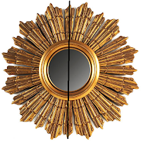
Axis

An axis is a straight line that goes through something to show a specific quality.

The images above show how a line of axis can show symmetry.

Image From:
http://home.earthlink.net/~jdc24/motif.htm